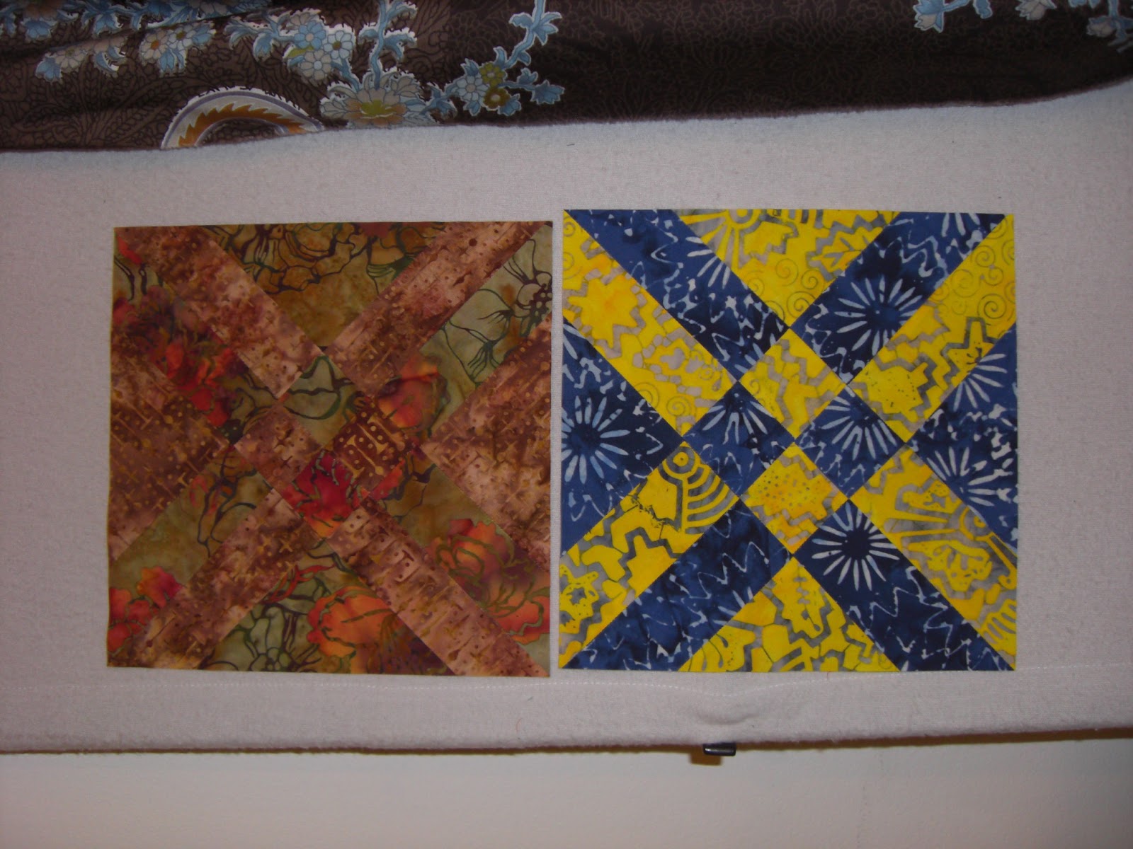
Using Anita Goodmann Solomon's Anita's Arrowhead pattern, I'm playing with contrast. When I see a couple of interesting fabrics, I make a block out of it, trying to find a sweet spot in contrast that pleases me.
So far, so bad, but all are worthy attempts.
Here are
- Too much contrast - the blue and yellow
- Too little - the browns
- Not quite right - the blues
What's missing on the blues is that the bright blue of the one fabric is indeed present in the darker fabric, but in such a small quantity that it looks kinda like they don't match at all.
At least I'm on the learning curve.


No comments:
Post a Comment